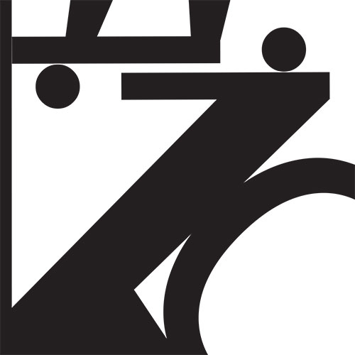
| The typography project focused on using fonts abstractly to create images in which it might be unknown to the viewer which letters from the alphabet were used. Each composition used five different letters in various fonts to create an interesting image. I found that making the letters oversized helped add to the abstractness of the compostitions because it made them harder to recognize. It was also important to consider the types of font used within each image. I found that it was more difficult to place serif and non-serif fonts together in an composition. |
 |
|


