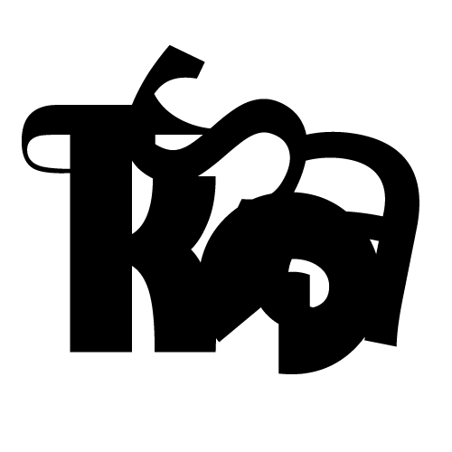
For this typography project we were intstructed to create abstract shapes out of 5 letters. The letters I used are k, a, t, e, s as they are a part of my name. We used 25 different fonts as the constraints of the assignment were to use a different font for each letter and not have any repeats. I enjoyed pushing myself to disguise the most identifiable parts of fonts such as the serfs and recognizable letter structure. I created the second image in the slideshow with only serif fonts but for the rest of the works I chose more sans serif fonts because the block aesthetic of those fonts contributed to my abstract designs. The fifth image in the slideshow was created using a triangle pathway and I trimmed all parts of the letters falling outside the triangle to create a geometric abstract image. I was inspired by the thick block lettering of sans serif fonts that I so often gravitate towards in any graphic piece I create. I challenged myself to see these fonts I use so regularly as shapes to be manipulated rather than letters to display literal meaning. |
 |


