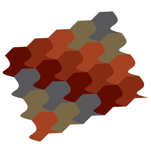
| After creating our tessellations, we were then tasked with using them to explore color theory by applying these concepts to them. We had to create a 2d and 3d color composition in Adobe Illustrator by importing our AutoCAD files in. We were assigned to choose a color scheme and use the same set of colors in both compositions. For this I used an earth tone preset color palette from Illustrator paired with a split complimentary color scheme to get the colors used in both compositions. The first composition is the 2d one, which conveys a much flatter image with the colors arranged in a pattern but not one with complexity of depth. The second of the two compositions is the 3d one, which uses the same colors but arranged in a different pattern. This pattern tries to convey a sense of depth by transitioning from the red colors to the blue colors all while using lighter hues moving down creating a sense of changing depth as your eyes move down the composition. After creating these two I chose the 3d composition to be cut into stickers and attached onto the wooden tiles we previously had made. My sizing was off so I had to cut some of the edges making them a little frayed, but I tried to incorporate some negative space into my piece while picking 5 important shades that conveyed the color scheme. I thought this was a very interesting way to learn about color beyond what I had previously learned. I’ve gained a better appreciation for how colors play off each other in more complex ways than similar tones. |
 |
|


