| Eamon Kelleher | Elements of 3D Design |
|
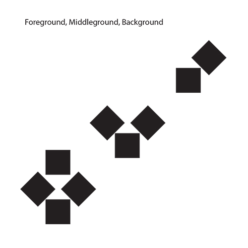
In this assignment we were tasked with creating seven compositions to demonstrate the design principles from Gestalt theory. To create these compositions we used Adobe Illustrator using only nine squares with 1x1 inch dimensions, and only in black and white. The inspiration and concepts executed in each composition are listed below. Foreground, Middle Ground, and Background: By using reducing numbers of squares in similar positioning I was hoping to achieve an illusion of depth. The idea was that the further back the depth goes the less squares it would have. Figure/Ground: In this composition I was trying to convey a relationship between the figure created by the squares and the surface, being the white background. To do this I created a figure with an opening in the middle and added a diagonal shape in the middle to create a stronger contrast with the background. Closure: In order to convey a complete shape despite all parts not touching I chose to pull apart smaller pieces of a larger square to give the viewer the illusion they all are together even though they aren’t. I also moved them at varying distances to try and convey motion as if they are coming together. Proximity: I tried to arrange the squares in a way that conveyed different groups of shapes. The ones with more proximity to each other form one group, while the outliers are perceived as apart from them due to a lack of proximity from the main group. Symmetry: This composition is very straightforward and conveys the symmetry across the entire canvas. The canvas can be split diagonally and show the same mirrored image on both sides. Continuation: The idea behind this composition was to create a line of sight that the eye follows even though the path continues off the canvas. To do this the squares start close together and move further as they go conveying a line of motion that the eye can follow even suggesting it continues off the square canvas. Similarity: This composition uses a “odd man out” sort of execution by making one square stick out among the rest. The goal was to make one shape more noticeable amongst the others due to a lack of similarity. I did this by rotating the square and moving it out of the expected spacing. This assignment was a great way to gain experience in Illustrator, and to understand more about basic design principles. It was an interesting challenge only being able to work with the same nine squares of all the same size, but it was very satisfying in the end. |
 |
 |
 |
 |
 |
 |
 |
 |