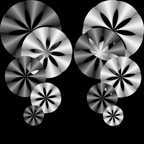
This project focuses on how to use color and shape to create an illusion of movement. These compositions were all created in Adobe Illustrator. The first composition is achromatic; it has black, white and seven different values of white and black. I created darker and lighter shapes to show the contrast, and also created a vision illusion to view the pieces of object are rotated. The second composition used Basic Primary Colors. I used red as the back ground. Moreover, I used yellow and blue as the pair or primary color. For this composition, I changed color and size gradually from the right top to the left bottom to create a rotated and falling feeling. The third composition used Complementary Colors. I chose blue-green and orange as a pair and their values. I used different shapes of the orange shape and gradually changed blue-green shape to create a movement and a feeling of radiation from far back. The fourth composition used Analogous Colors with a warm relationship. I used yellow as background and used gradually changed colors from yellow-orange to red to create a visual illusion. If you stare at it for some time, you can see the movement. The fifth composition used Analogous Colors with a cool relationship. I used blue and yellow-green crossing each other as background. Moreover, I used green and blue-green to create a stereoscopic giving a feeling of mobius. I was inspired by Monument Valley. |
 |


