| Alejandro Carrasco | Design Fundamentals |
|
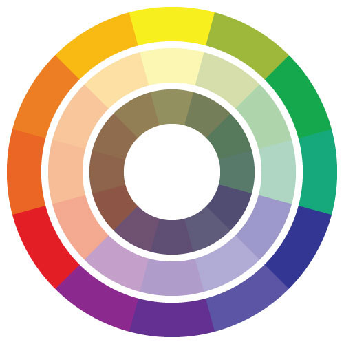
The second project that we had to do was the color theory project. In this one we had to do 5 different color designs in different color schemes while using only basic geometric shapes. The color shemes are the following: Achromatic: In this design we had to use 7 different values between the colors black and white. In my design I decided to make a star that pops out while making it abstract. Basic Primary Colors: In this design we had to use basic primary colors; red, yellow, and blue. We also had to use at least 7 different shapes. I decided to make the background blue and use the colors red, yellow, and inbetween to make an idea of the sun. Complementary Colors: In this design we could've used any colors we wanted that were complementary to each other. Since my favorite color is blue I chose that and the complementary color of blue is orange, so I used the different shades of orange and blue to make an abstract design of several doors. Analogous Color with a Warm Relationship: In this design we had to use colors that were part of a warm relationship, those colors include red, red orange, orange, orange yellow, and yellow. The design was inspired by a lava lamp idea/design. Analogous Color with a Cool Relationship: In this design we had to use colors that were part of a cool relationship, those colors include green, light green, blue green, blue, blue violet, and violet/purple. For this design I decided to make an illusion of the box inside of a box that kept going for iternity. This was made by using Adobe Illustrator. |
 |
 |
 |
 |
 |
 |
 |