| Erin Crawford | Design Fundamentals |
|
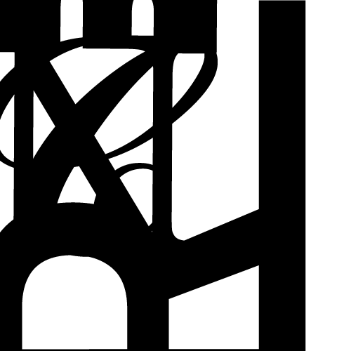
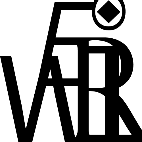
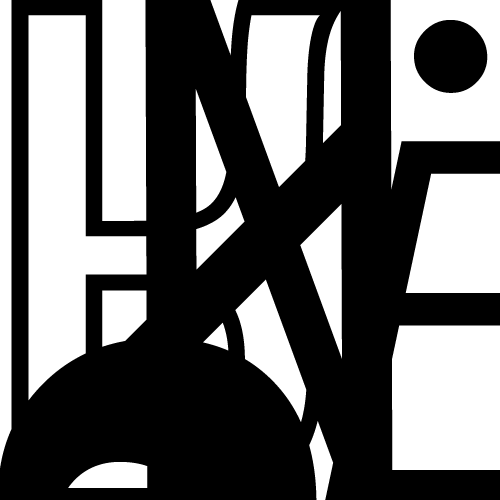
| This project involved principles of typography and compostion. The objective was to create five different compositions using five letters from my name [E R I N C]. The challenge was to make the letters as difficult to read as possible while still creating a well- composed piece. Different typefaces could be used and the size, rotation, and reflection could be manipulated. In addition, the letters could be croipped off of the page and overlapped. These images were created using Adobe Illustrator. |  |
|
 |
 |
 |
 |